Editor’s Notebook: Our Homepage Triptychs
April 2022
We always knew Waterwheel Review would be fully a child of the internet, an online magazine that would make use of and celebrate multimedia. We wanted to support and expand on each piece we published by presenting it with companion art, knowing the web would provide: paintings; photographs; music and singing; videos of dance and other performances, presentations, and compositions. We also knew it would take a great deal of focused energy and attention to select appropriate companion pieces, then get the design of each issue just right. To ensure we could deliver, we’d need to strictly limit the number of pieces we publish each issue. The right number, we decided, was three.
Next, we settled on the number of companions for each publication: two. If we presented more than two, the design would look like a chain or a grouping, inevitably the connections loosening and draining the intimacy between publication and art. With just two, each companion sits next to the star piece of writing—or, more precisely, the excerpted beginning of the publication, which links to the full text, in turn presented alone so the eye can focus on the writing. One companion wouldn’t be intimate enough; we like the sense of embrace that comes from companions left and right. Again, we rely on the power of three: One publication plus a companion on each side make a triptych.
Developing the three triptychs for each issue is a serious labor of love for all of us, and feeds our connection to every Waterwheel Review publication. We are very attached to all of them. But yes, of course, we have our favorites, though that’s a big group—we reviewed our archives for this post, fueling texts and emails gushing about no fewer than eleven of the fifty-one total triptychs we’ve produced. It was very difficult to whittle our favorites to just one each, and the process yielded small surprises. A couple of our favorite companions, for example, aren’t part of our chosen triptychs, which, again, speaks to the power of three.
Note that before each reflection on the chosen triptych, you’ll see an image of the triptych as it appeared on our homepage. In the reflection, we’ve linked each of the original two companions so you can see them in all their glory.

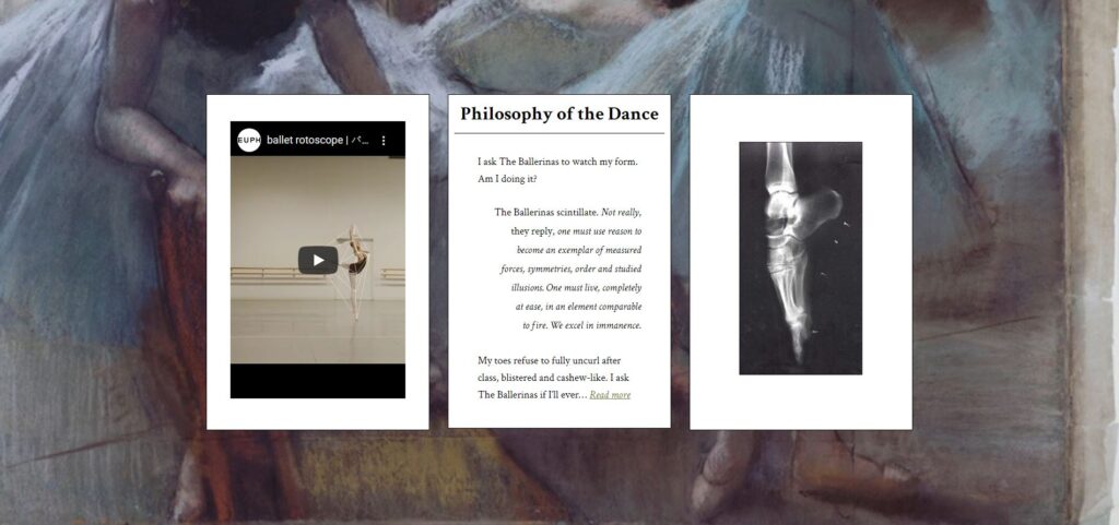
Claire’s favorite: For “Philosophy of the Dance,” by Brooke Middlebrook, Issue #11
I love the softness of the background, which frames the hardness of the video of the rotoscope image superimposed on the dancer. This effect demonstrates just how difficult ballet is—the required angles, geometry, and quickness of movement are extraordinary. The x-ray of the foot en pointe echoes the hardness of the rotoscope effect, showing in stark relief the structure necessary to endure the pressure on the dancer’s body as she performs with such balance and grace. And I so love the opening two lines of the publication. The narrator asks if her form is correct, initiating a back-and-forth throughout the piece that reflects the delicate balance of form and grace in dance.

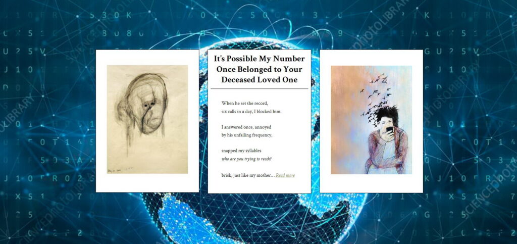
Suzanne’s favorite: For “It’s Possible My Number Once Belonged to Your Deceased Loved One,” by Peggy Hammond, Issue #12
While the birds in the painting “Detachment from Reality” can be interpreted as what’s being missed, I like to think of them as messengers connecting the woman to far-flung loved ones, perhaps to the loved one in Peggy’s piece, who now exists outside of time and place, as untethered as her caller. William Utermohlen’s “Head 1,” a self-portrait sketched late into Alzheimer’s, also shows a man out of time and place. Both pieces are set against the background rendering of global communication, which erases time and place, and leaves us staring at a small box, witnessing the world.

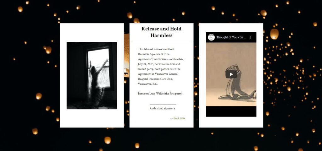
Cheryl’s favorite: For “Release and Hold Harmless,” by Lucy Wilde, Issue #15
I’m drawn into this triptych by the title, “Release and Hold Harmless,” floating with the lanterns in the background, symbols of releasing and holding hope, grief, or renewal. In the photo to the left, the woman at the window almost begs to be released. The still of the animated image to the right is intriguing because it’s abstract and yet intimate—it looks like it might be the mirror image of the woman at the window, a rendering of what she’s feeling—and I’m pulled in by the title “Thought of you” and want to click play. The dark and muted colors of both companions nicely complement the text in the center, immediately recognizable as part of an agreement or contract, binding all this hope for release into something stark and concrete.
That’s the best we can do to convey why we feel so drawn to these three triptychs. Tomorrow, we might settle on three different favorites. Next week, another three.
—Claire Guyton